Monday, 28 December 2015


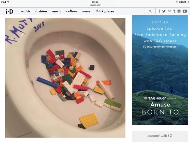
The edited cup for experimental purposes. I had the idea that I would use an actual mug as the logo design, but it didn't quite look fantastic. So, after a couple of edits down and this being as good as it could quite possibly get - I decided to ditch the mug idea and go back to the drawing board. (The drawing board where taking a picture of a cup wasn't on it) 

Illustration Compilation

This is a compilation of my doodles that I considered using within the process of creating my Final. I didn't use the all because after trying out a few different ideas - I decided they weren't just right for my design. So, therefore I only used the ones that worked well compositionally and decided to draw up some more that I thought would fit well. This is them all together!
Edited in Photoshop, scanning them in and changing the alteration of the colours to make them crisp - then using the paint brush tool and opacity to add shape, form and colour. 

Thursday, 17 December 2015

Ai Wei Wei and Lego

Last month, Chinese artist Ai Wei Wei made headlines when he called out Danish toy company LEGO for its "censorship and discrimination", when they refused to sell him a large order of their iconic coloured bricks, on the grounds that they do not support the use of its products for "any political, religious, racist, obscene or defaming statements." In retaliation, Ai Wei Wei has launched an attack on social media, by posting over 40 images of famous political activists and religious figures all made out of LEGO, with the aim of sharing 10 images each day for 18 days. "What we're doing is fighting for very basic human values," said the artist, "such as freedom of speech and human rights." So far the artist has posted portraits of Buddhist monk Thich Quang Do, Egyptian blogger Ahmed Douma, and Nobel Prize-winner Aung San Suu Kyi, and you can expect many more to come.

How I feel -
Ai Wei Wei is so right in doing this. I'm not surprised that Ai was unable to do something, yet again; with how opinionated these people are towards Ai. He's a passionate character and I can't wait to keep up with the images he is releasing!

Wednesday, 16 December 2015

Religion - Buddhism

Buddhism 


Reincarnation 

Reincarnation is the act in which you are reborn once you have died. A constant depiction of life where one does genuinely never really 'Die' - Samsara. Samsara is highly predominant within the Buddhist religion. You do, however, change our 'outer shell' when reborn - you are reformed character but the inner personality remains the same. You may be reborn as a different species - but your spiritual internal basis stays the same. 

This applies to Metamorphosis because you are changing your outer-shell and becoming (transforming) into another. A Buddhist solely believes this is the outcome once you have passed your human form. 


Corporal Cognisance - Sherri Cornett

LENSE BASED ART


"Our bodies are repositories of our memories and experiences– not just in our minds, but also in the fibers of our muscles, in the expressions of our faces, in our movements, in our rhythms. The shifts in this piece reflect body rhythms: background (eye blinks), journal (respiration), images of travel (upper left, daydreaming/theta brain waves), nature (upper right, deep sleep/delta waves), family/friends (lower left, problem solving/beta waves) and random memories (lower right, meditation/alpha waves)."


I believe this applied to Metamorphosis because of the body. We grow, change and every 2 weeks we even shed our outer layer (skin) to renew itself. We constantly change and grow in different ways - transforming into something ever so slightly different. We are born to slowly but surely die, too (depressing fact of the day ha). We develop wrinkles, we age. We are constantly changing. Sherri Cornett's Lense Based Art piece shows our skin; our wrinkles; our muscles and blinking. Nature, family, friends, memories. Everything that regularly and frequently changes on a regular basis therefore supporting metamorphosis. I like the style in which she has made this Lense Based piece because I think it's a very spiritual piece. It's very unusual and makes you think in depth, which was indefinitely her intention. 

Installation by Anila Quayyum Agha

"Winner of both the public and juried vote of artprize 2014, pakistani artist anila quayyum aghaexercises the architecture of the grand rapids art museum in michigan by infilling it with a dynamic interplay of shadow and light. ‘intersections’ comprises a 6.5-foot laser-cut wooden cube pierced with carefully crafted patterns and illuminated from the inside, which casts expansive, lace-like geometries onto the surrounding walls, ceiling and floor. ‘intersections’ mirrors the geometrical patterning present in islamic sacred spaces, and is derived from the artists own experiences growing up in pakistan. the wooden frieze emulates a pattern from the alhambra, which was poised at the intersection of history, culture and art and was a place where islamic and western discourses, met and co-existed in harmony and served as a testament to the symbiosis of difference’, quayyum agha explains. ‘for me the familiarity of the space visited at the alhambra palace and the memories of another time and place from my past, coalesced in creating this project."


Source
Inspired by mosques that she has visited. She took photos of the structures that inspired her, which later than determined her own designs to develop her piece. This is a Box with a light inside to project the imagery all over the room. When people go to see it, they instantly become part of the sculpture because they have the patterns on themselves. 
I

UNIT 79 BRIEF

Sticking with the theme of metamorphosis.


Tuesday, 15 December 2015

The tests of the boxes

This box was a box that I drew up finally. I decided I would base it off of a 'happy meal' kind of box, with a few shape differences. This was the only box that worked; the only one that actually looked worth using and the only one that looked relatively professional. As you can see by the Net Design - It does relate well to the McDonalds Happy Meal box except for a few difference and the fact that it isn't a happy meal box. I created it on Illustrator, grouping parts together as I went along to make sure the box was a complete set and wasn't just some dots that don't actually join together.


The above two boxes didn't work. They really just didn't. After completing their box design, you can tell just by looking that they don't look as though they were going to fit. However, I did end up printing them off and the boxes obviously weren't to measurements because neither fit accurately enough without them looking really unprofessional and some of the parts left a gaps (which is something I didn't face an issue with the box I actually used.) To conclude; I did lose the images of the testing but it isn't hard to work out by eye that they REALLY were not going to work.

Failed Design

A design that I tried for the Coffee. Infographics on the box - which didn't work very well. Possibly because the combination of the illustrations and the photography background/possibly its even the illustrations themselves, so I tried out doing the next design which just so happened to be my final (see the post in which contains all my finals for the design.) 

Testing out different logo designs and the promotional stance (P.O.S)

This is just a sketch on how I could intentionally show my final result in a store. I envisioned my box designs and cups on a box covered in sticks. I see that as something that could really grab a buyers eye - especially considering not many cups are presented on a stick covered box. Ideally, if this was a proper point of sale as oppose to a 'mock up', I think it'd look fantastic on a genuine Log!
Here is me trying out a few final Logo designs to make sure I haven't missed out on a better design. Although some of these designs are quite intruiging - I feel as though the official final design is above and beyond better than those that I have tried out prior to these. The actual design was compositionally strong, looked professional and definitely caught your eye as oppose to something that left no room for integrity or debate.

1. Ad Shell, Box Designs, Logo, Magazine Ad, Card (Infographics)

Add Shell - This is what I decided to develop as a design for my advert. I believe it works unbelievably compositionally well as it's bright, complex but simple, gets to the point and makes everybody automatically click onto the design. I believe that if you were to drive past this ad shell in the car, you'd definitely be drawn to the advert! It doesn't blatantly scream 'Twin Peaks' so those who don't know what twin peaks is, aren't actually put off by not knowing about it; yet those who do know of Twin Peaks would indefinitely know the intention.  

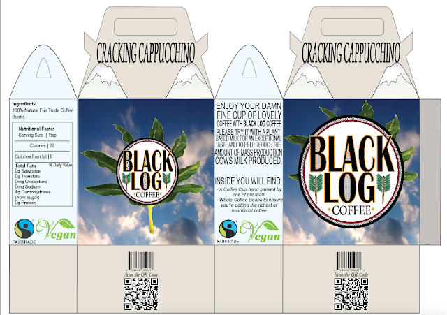
Box 1 -I tried to change each colour of the boxes to determine the strength of the coffee which you would get inside. The names intentionally play on the actual coffee inside - This time being "Cracking Cappucchino" which I thought would be a fun way to tell the buyer what coffee they're buying. This colours were slightly lighter as the colour of a Cappucchino is the lightest out of all of the other coffee's I would be selling.

Box 2 - This design is the middle colour between the two to, yet again, reflect the colour of the coffee (strength). This box is named "Luscious Lattee" - which now that it's too late to change, is actually spelled incorrectly. However, it doesn't matter because the mock design is happily spelled correctly and if this was an actual design that was going to be sold, it would indefinitely be correctly spelled especially considering the design would be looked over by many people before going into production. 

Box 2 - Box 2 is the darkest of the three. This box shows how dark the coffee would look due to it's strength and the coffee is named "Magnificent Mocha". Happily, this design is all spelled correctly and this colour actually makes all the designs on the box 'pop' and stand out. This makes the mountains look very predominant and that is quite eye catching or everyone and colour probably make people want to buy said product.

Over all, the box designs worked quite well. The compositional factors were strong, especially considering the photography, illustration and graphic work - which tells me that it would definitely be boxes said customers would possibly consider buying. After all, the first judgement a customer determines their buys on, is typically the exterior of the box. I made sure there was a scan code, a QR Code that led to a website of the products, a Vegan sign because not enough products tell you straight up that a product doesn't contain any animal products, a Fairtrade sign, the nutritional factors and the logo; big and bold! 

This is the Logo that I finally decided would work well with the rest of my boxes and the rest of the designs. I created this on illustrator, which I based off of a design I sketched that I didn't think would work. It was an experimental pieces that I initially designed as a quick mock up to see what it looked like but I liked it a lot. That then became my final with a few tweaks! That being said, this is the final result. I incorporated the Black Lodge zig-zags, then I based the 'coffee' with the dots at both sides off of the generic New York Coffee Shop format that is really common within the coffee community. I also incorporated a leaf that I took a photo of, which many who have seen have said it looks slightly like a marijuana leaf - which colour relate to how strange and chilled twin peaks actually is (like an unintentional pun). Last but not least, I used an illustration of trees, that could be depicted as either the bottom of arrows (almost native american which does relate to the colour scheme of things) or the actual thing which is trees.


Coffee Box-  This, the coffee box, is a simple looking box with a combination of photography and the logo which is created on illustrator. The while ovals is to reflect where it will be transparent so you can see the coffee inside of the box. Above the oval on both sides, it does say "Damn Fine Cup Of Coffee" which is a Twin Peaks reference but if somebody didn't know that, they'd think it was just a quirky play on words. 
Infographics- This is the inforgraphics that will be in every box that goes out. This is the over-all look on things - an over-all insinuation on how to create the average yummy glass of coffee. The infographics are created by hand and then scanned in to make sure the images are crisp and pure white/black, with no colour incorrections. The leaves make an appearance again to keep the theme. The logo is on it too, which makes sure people know what they're drinking (in case they forget...)

This is a screen shot off the Magazine Advertisement. I intended to keep it very simple but very eye catching. The logo is very bold as usual and central to catch an individuals attention immediately! The background would be white, however the background on this does show up to be transparent. I made sure it said "Buy It Now" Which I don't actually believe is too forward!